All,
I’ve created a wordle statistics aggregator – if you would like to view it – please go to https://coolsciencey.com/wordle-stats-sciencey

Science and Engineering Unleashed
All,
I’ve created a wordle statistics aggregator – if you would like to view it – please go to https://coolsciencey.com/wordle-stats-sciencey
Find the GitHub code here. See the completed covid-svelte-sciencey dashboard here.

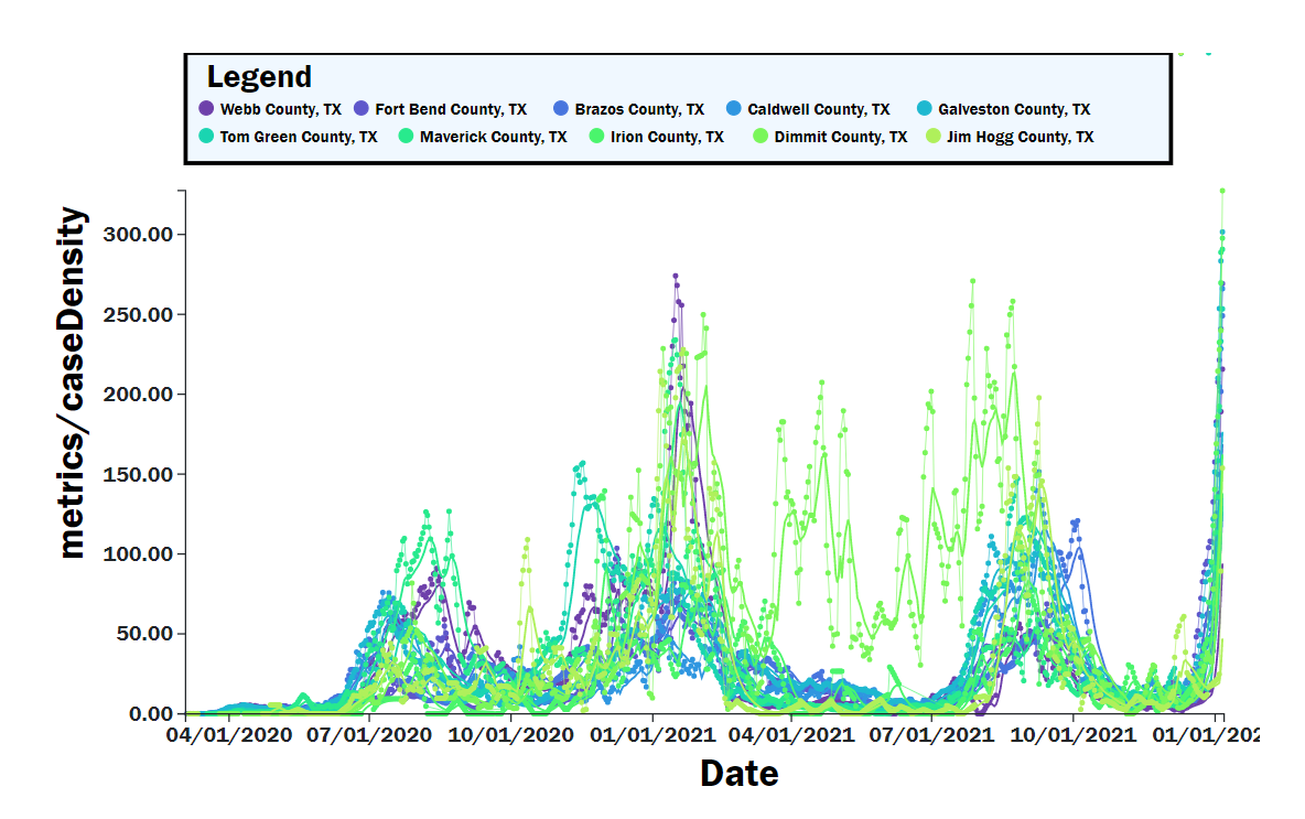
After doing the covid-dash-sciencey post a while back, my desire to learn front end web coding to make cool interactive dashboards had just begun! Python and Dash were cool, and were relatively easy, but I had a desire to go straight to the source – Javascript! I had completed several certifications in front end programming (html/css/javascript) through Free Code Camp.
After completing the course projects, I spent some time building out a Covid Dashboard using API data from https://covidactnow.org/, a very good website with a free and open API. The code is really an extension of the D3.js (data visualization course on free code camp), which is a powerful graphics library for creating interactive visualizations within web browsers from data. See some examples above. I was also able to use several svelte components (sveltestrap, svelte-multiselect, gridjs-svelte), which were easy to implement and not too difficult to track down on Google.
So I have been going through some code tutorials to learn front end web development. I was familiar with HTML back in middle/high school, but I have not kept on on modern web development at all! Nonetheless, I feel like all the great coding that I have done for computations, etc is cool and all – but having the skills to create a nice front end user-facing tool is really needed to bring that great work to broader audience. I had experience doing wxPython applications back in grad school, and recently I have learned R-Shiny which is quite powerful. Now I’d really like to get to the basics with some JavaScript!
As such, I’ve been using FreeCodeCamp‘s online courses to begin to develop my skills (so far I have done the Responsive Web Design Certificate and Javascript Algorithms and Data Structures Certificate in my limited free time after work. Honestly, the website says that it takes 300 hours, but I completed both in much much less than that.
I recently completed Front End Development Libraries certification, and I’d like to use this WordPress Page to link to the JavaScript projects that I’ve been working on as well as to document some of the things that had to be done to get these projects stood up on my own machine (and eventually on coolsciencey.com).
For these projects, i desired to manage my own environment rather than use codepen.io. I used Windows Subsystem for Linux (WSL) which comes pre-installed with Windows 10+ (really a game changer for coding on Windows, in my opinion). After installing WSL; install Ubuntu from the windows store and you’re good to go.
I was able to get everything set up on my linux environment, and I wrote up these instructions on how to do it. Which were a combination of the sources found in the “References” section.
Consider using pnpm rather than npm, which does not re-install dependencies every time resulting in smaller development disk space usage! I had to manually install some d3 dependencies to get it to work with svelte-kit, but otherwise didn’t have any issues.
At first, for project 1, I used React/Redux as was taught in the Free Code Camp course. The React front end framework, backed by Facebook is a very popular front end library and it seems like a natural choice for folks who are just getting started. Unfortunately, state management through Redux, I felt, made this approach more complex than was necessary (especially for simple apps like this one).
For projects 2-5 I decided to use Svelte which was recommended to me by a colleague. Relative to React, this new front end framework(not actually a framework, more of a compiler), is supposed to be more lightweight than React and faster to load. It is growing fast, but is not nearly as widely used as React. As I was learning Svelte, I found the Svelte web tutorial very informative and was more than enough for me to get started with the language to complete these projects. I found the syntax of Svelte to be quite appealing and easy to understand and interact with; it also created very lightweight apps and worked will without a huge learning curve.
“Data Driven Documents” or D3 – has always intrigued me as a way of displaying charts and graphs within a web browser. Previously I had used a d3.js product, Plotly, in projects that I had built in Python and R. While the interactivity of Plotly charts is very good out of the box, I felt like learning D3 would be a worthwhile use of my time since it’s the gold standard for data visualization in web browsers. The Free Code Camp Data Visualization Certification is a decent introduction to API calls and using D3. I found the examples themselves not particularly useful – but the projects were a good way to build a decent skillset in setting up simple (and some more complex) d3 charts. I had done this one in Svelte as well, but honestly not many Svelte components were actually used in my projects; however I think that Svelte and using Sveltekit is easy enough that it made sense to start a new project with this every time!
Anyways, this was a nice experience, and I think that my next step will be to redo my Covid dashboard using JavaScript!
Obviously with the global pandemic ongoing, a very serious issue, I have been looking at various sources of information for daily cases, etc. especially WorldOMeters.Info – Coronavirus , Johns Hopkins Coronavirus Resource Center, and the New York Times Coronavirus Map.
While these existing dashboards are great, I wanted to learn how to put together my own as a learning exercise. This was a good opportunity to exercise my Python skill using Plotly-Dash using the widely available Covid-19 data that’s available on the internet (I chose the New York Times GitHub data source as my starting point, which is updated daily).
You can access the embedded dashboard below, or you can view the full screen one directly from Heroku: https://covid-dash-sciencey.herokuapp.com/. The code is available at my GitHub zacharygibbs/covid-dash-sciencey. I will include a write-up below on how I went about learning how to build this dashboard and where you can find the code.
Building this dashboard and deploying to GitHub/Heroku was straightforward after following some online Examples and the Dash Documentation.
If I was starting again from scratch, I would have liked to have found the following all in one place without quite so much googling –
This Post on the Plotly Community docs lays out how to arrange your dash app to have multiple columns. It all starts by linking an external stylesheet
(external_stylesheets = [‘https://codepen.io/chriddyp/pen/dZVMbK.css 72’])
Then using the class name and defining as rows or columns nested to suit your needs.
html.Div(className='row', children=[
    html.Div(className='six columns', children=[....])
    ... (repeat as needed)
])
Apparently the ‘six columns’ can be adjusted to suit your desired width (apparently, each page is divided into 12 columns), meaning that ‘six columns’ is what you would use to divide into halves. For my covid-dash-sciencey app, i did a ‘three columns’ and ‘nine columns’ setup to get 1/4 width column for menus and 3/4 width column for charts.
Ultimately, the goal of my simple app was to display the data while allowing for the user to filter based on state/county and to toggle between cases/deaths and linear/log scale. This is something that I had found difficult on other dashboards (either was not done consistently, or was difficult to navigate). I was able to find a great example of filtering based on control dropdowns and radio buttons on the Plotly Community page.
The interactive portion of Dash comes in the Dash-Callbacks. This example allowed me to understand the Input and Output arrangement of the callbacks and how to very easily pass them between objects within the app.
After tinkering around on my localhost (127.0.0.1) for a while, and eventually deploying within my wireless network (0.0.0.0.0), I was ready to deploy the app more widely. Several great examples explain how to set up your application for deployment to Heroku: (Plotly Docs, TowardsDataScience example, this article). Being a Linux noob, I referred to these articles extensively to set up my virtual environment, install all of the requirements, and eventually deploy to heroku local. It’s amazing how powerful and simple these scripts are (when they work), but sometimes it’s just getting everything set up that takes a while.
I had recently purchased a Raspberry PI 4 B from Adafruit. This latest version was a step change improvement over my PI Model B that I originally bought in 2013.
In order to get Dash up and running on the Pi’s arm7l processor, I had to install
Raspberry pi BerryConda https://github.com/jjhelmus/berryconda
Great learning experience! I hope to build more apps in the future.
As was the theme of a previous post, the goal of this post is to perform quantitative analyses of several personal finance areas. Previously, I looked into the real cost of paying down debt first, a-la the Dave Ramsey method. In this post I will consider the options of what to do once you have paid off those debts. After contributing 15% of your income to retirement and saving a 20% down payment for a home, additional money can be put into either additional principle payments on your home “Home First”, or placed into a taxable investment account “Investment First”.
The math problem is simple–it will be better for the numbers to invest these funds where the higher rates of return are. Generally, a taxable investment in such as in mututal funds or ETFs (7%+ returns generally) will be better than paying additional principle on your home mortgage (<5% interest generally). My goal here is to put a dollar value on the upside; this can help to place a value on the higher risk equity investment route.
Assumptions were made with respect to income, expenses, etc. as described in a previous post. Figure 1 shows the 10 year net worth calculation given that the priority is to pay the house off first (while at the same time saving 15% to retirement). This can be compared to the distribution of net worth shown in Figure 2 where the minimum payment is made on the 15 year mortgage, and additional savings is placed in after-tax investments (assuming 7% annual return). In these calculations, an initial debt load is paid off over the first 4 years. Afterwards, an emergency fund and mortgage down payment (20% of 200k house) is saved. This calculation only accounts for a relatively short timeline of only 4 years of home ownership (home purchased once a down payment was saved at month 77).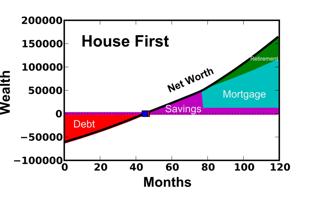
Figure 1: House First option where a 15 year mortgage is paid with priority once the house is purchased. Retirement savings of 15% of income also occurs. 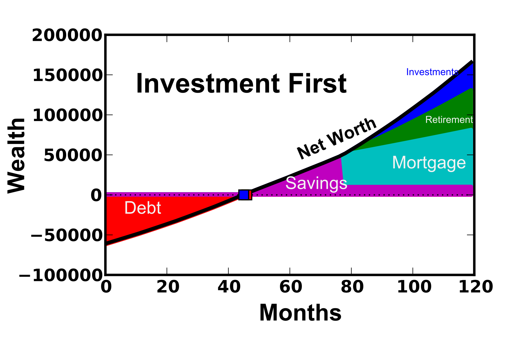 Figure 2: Investment First option where a 15 year mortgage is paid with priority once the house is purchased. Retirement savings of 15% of income also occurs.
As expected, the “investment first” option comes out ahead by ~$1800 after this 10 year period (after-tax net worth $152,900 vs. $151,100). While this is not a small amount of money, it is not a significant amount in the grand scheme of things (only ~1.2% greater net worth). There are fair arguments on both sides. “House First” folks may prefer this option because they are particularly debt-averse or that they are worried they would spend the extra money if they kept it in cash. The “Investment First” option makes sense for people who are investing for a longer time-frame and may be interested in having the money more accessible (not tied up in the illiquid mortgage).
One additional calculation was performed to assess the mortgage length of 15 or 30 years. Previous calculations were performed with a 15 year mortgage, but some people may prefer leveraging their debt load and re-investing the saved money. However, because the interest rates on 15 year mortgages tend to be lower (I used 2.5% interest rate for the 15 year rather than a 3.375% for the 30 year loan), the interest payments will be quite a bit larger when a 30 year loan is taken. Figure 3 shows the 10 year, after-tax net worth for the 15 year mortgage where the “House First” option is chosen vs. the 30 year mortgage where the extra money is paid to investments using the “Investment First” option.
Interestingly, the 15 year “House First” net worth still increases with investment rate of return because of the retirement contribution. However, it is clear that for investment returns greater than ~10%, the 30 year “Investment First” option is more attractive. Now over its lifetime, the S&P 500 has >10% average annual rate of return (for long term investments), and so generally the 30 year “investment first” option will be better. However, in the short term, the variability of the returns make this far from a guarantee and highly dependent on market conditions. Because of the “personal” aspect of personal finance, the decision to choose one option vs. another should be made by each individual.
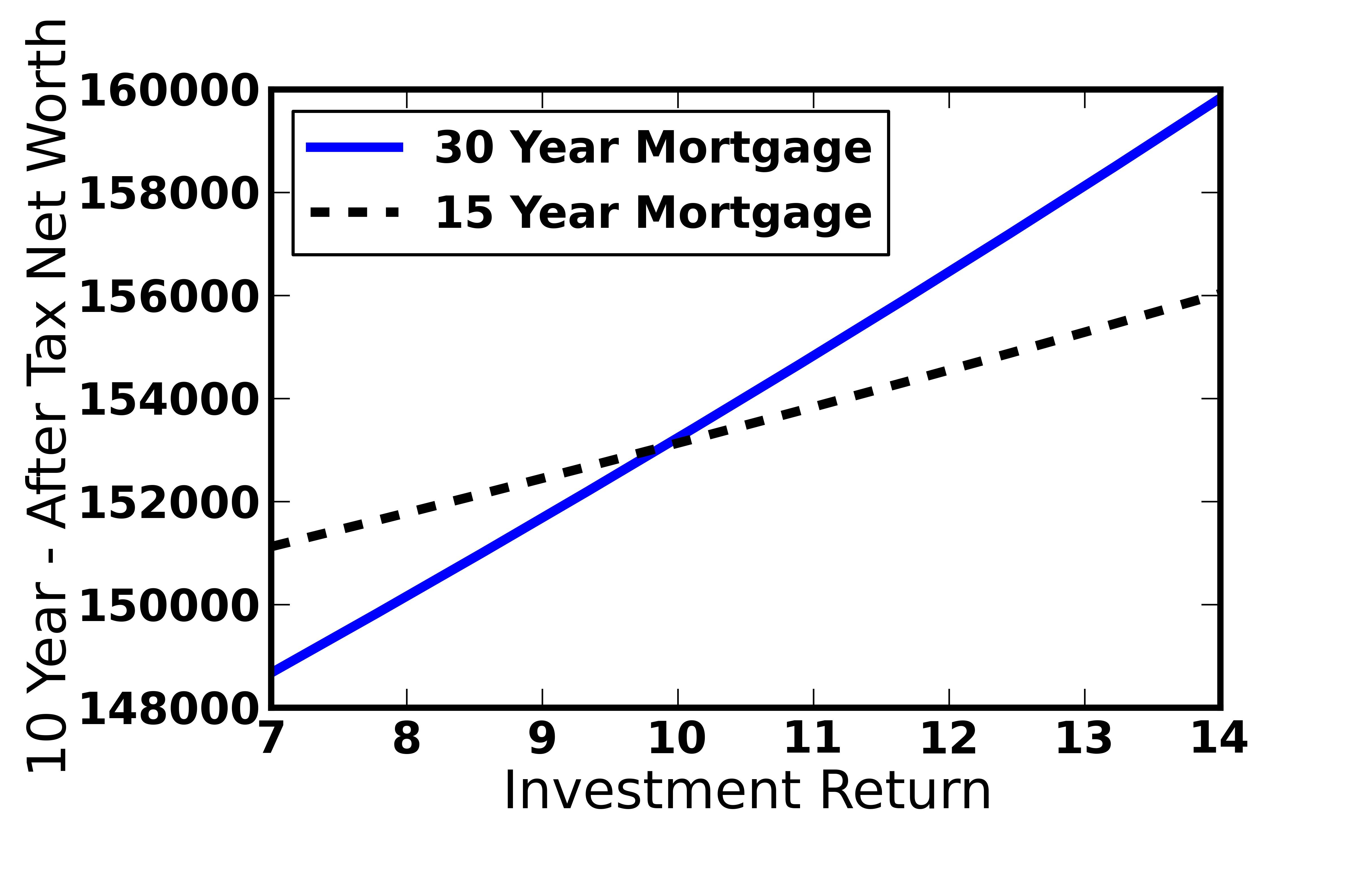 Figure 3: Comparing a 15 year (House First) and 30 year mortgage (Investment First) with investment preference as a function of the investment return.
Even though the “Investment First” option leads in these simulations, the difference is less than $2000 (out of ~$150k for this 10 year period). A large portion of this 10 year period was spent paying off debt and saving for a down payment, so the differences will become larger over longer time periods. Ultimately, this decisions should come down to whether you would prefer a guaranteed, illiquid return by investing in your mortgage, or a riskier (certainly in the short term) but more easily accessible investment in the stock market.
As I’ve exited school and begun in the working world, I have developed an interest in personal finance. In particular, I’ve been interested in the best way to pay off debts (student loan, credit cards, auto loans) in order to put yourself on a path to building wealth for retirement, etc.
In my pursuit of knowledge, I’ve came across a variety of strategies. One of the biggest Personal Finance personalities that I discovered through podcasts is Dave Ramsey. Dave Ramsey provides a series of steps that he promises will help you to get out of debt and become wealthy and generous. “Live like no one else, so you can live and give like no one else”. He stresses becoming debt free through hard work (picking up extra hours or additional jobs) and trimming down your expenses during this process (beans and rice!). After paying your debt down with “Gazelle” intensity, your payment-free budget can be used to quickly build up a larger emergency fund, save for a home purchase, invest towards retirement, and pay additional mortgage principle.
However, the Dave Ramsey method is not without controversy. Because debts are to be paid down with gazelle intensity, other savings goals are to be ignored until “Baby Step 2 – pay off all debts” is complete. Some people disagree with this, and don’t see an advantage to paying off low interest rate debts when the money could achieve mathematically more through retirement investing/etc. One of the more inflammatory things he suggests is not going for the company matching retirement contributions. Many people outside of the Ramsey circle see these matching contributions as free money (guaranteed 50-100% return!) and additional income that you’re passing up (www.reddit.com/r/personalfinance is another good resource). Ultimately, after listening to dozens of hours of Dave’s podcast, it’s clear that he doesn’t expect a “gazelle” intense baby step 2, i.e., a barebones sacrificial budget with extra work if possible, to take more than 2-3 years. If it does take longer than that, either you’ve got a ridiculously large amount of debt, a very low income, or you are not living on beans and rice (and your budget could be cut further).
The goal of this blog post is to quantify the Dave Ramsey method, in particular with respect to leaving out the 401K match. I will compare long term wealth building potential when following Dave’s steps versus other recommendations. Ultimately, it will come down to how deep you are willing to cut to give up the 401K contributions, and whether the psychological win of paying off debt exceeds that of saving for retirement.
First, I built a financial calculator that was probably overkill for solving this particular problem. I built in lots of little extras for computing your net worth and wealth distribution over time along with plotting features, etc. This code is available for free use/editing/contributing on the DaveRamseyFinCalc page on GitHub. I’d like to build a web-interface (Plot.ly?) at some point, but for now I’d like to get this post up. Future posts may follow with additional considerations with respect to the Dave Ramsey budget (one in particular is whether paying off your house early makes sense).
While it is possible to enter in a variety of values for your income, starting debt, assets, etc, I’m going to take a simple base case where you fit the following:
I’ve made further assumptions about how much you spend on food and utilities ($650 + $200 = $850/month); Including rent, this totals $1631 (on month zero, before inflation has kicked in). Further, a $1000 emergency fund is used in both cases until debt is paid off, after which 4 months of expenses are used. Other assumptions and additional calculation details can be viewed in the DaveRamseyFinCalc GitHub code.
First, I’d like to show the overall calculation results with expected net worth accumulated over time. Figure 1 shows the results of a 10 year calculation using the Dave Ramsey method (left) and the 401K Match preference (right).
Figure 1: Top) Wealth over a 10 year period using the “Dave Ramsey” method of preferring debt payoff. Bottom) 5% 401K Match, where retirement savings is preferred over debt payoff in the initial years. Wealth is given in $, Net worth computed is pre tax.
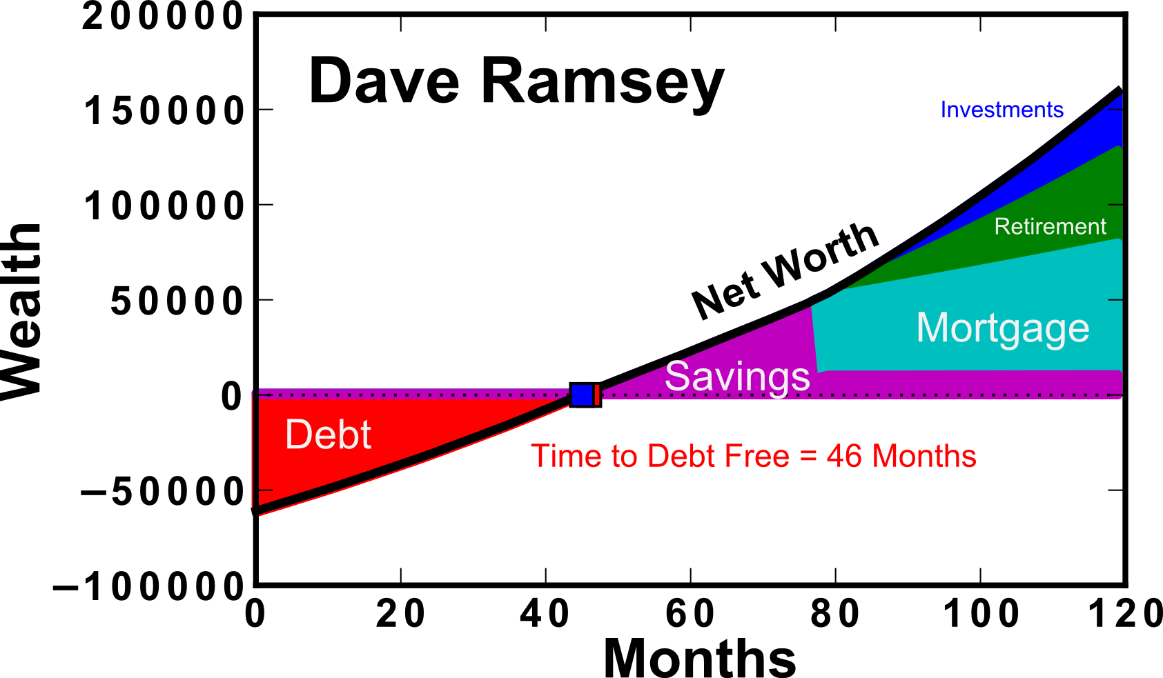
In this calculation, 401K contributions are assumed to be made “before tax”. For this reason, the “taxed” wealth should be used as a comparison between the two methods (dashed line) as shown in Figure 2. It is clear that when comparing the after-tax (dashed lines), the results are closer together. This is because retirement contributions are assumed to go in before-tax, which inflates the “net worth” calculation (solid line). When considering the Dave Ramsey calculation, you can see that there is no difference between the before and after tax net worth until ~80 months. This is because of Baby Step 3b, which states that you should save for a house down-payment prior to contributing towards retirement as well. This extends the length of time that you’re not receiving the match even past the time to debt-free.
Figure 2: Net worth over a 10 year period assuming the 5% 401K match or the “Dave Ramsey” method of paying off debt first. The dashed lines in their corresponding colors represent the “after tax” amounts.Wealth is given in $.
An additional calculation were performed varying the amount of the 401K match contribution offered by your employer. We can see that as the 401K match approaches zero, the 10 year net worth approaches $138k. The Dave Ramsey method does increase slightly with employer matching amount, however the rate is not as quick as when you’ve prioritized the 401K match. This is primarily due to the fact that it takes more than 3 years to pay off the debt, and missing out on this initial loading of your 401K causes a diversion of the 10 year net worth by as much as ~$50k for 401K Match of 10%. Table I also details the result as a function of match amount.
Figure 3: Net worth over a 10 year period assuming the 5% 401K match or the “Dave Ramsey” method of paying off debt first as a function of the offered 401K Match from your employer. Wealth is given in $.
Table I: 10 year taxed net worth as a function of 401K match amount (%).
So the previous plots show the real value of the 401K match, and how they can put you in a pretty good position relative to if you had prioritized debt payoff via the Dave Ramsey method. As an avid listener of Dave Ramsey’s, this isn’t something that he tries to hide. He receives the question often, and I’ll try to explain his justification. He sells the “gazelle intensity” where you cut your expenses back so much to attack the debt. As a result, the amount of ground lost on retirement would not be as large. Until now, this isn’t something that I considered, because both methods used the same monthly expenses. Further, this gazelle intensity combined with the “Snowball” Method of paying off your smallest debts first leads to the psychological wins necessary to keep lots of people going in this rough, beans and rice time.
I aimed to quantify Dave’s definition of “Gazelle intensity” by determining how much one would have to cut back their budget in order to attain a net zero taxed net worth in the same month as if you had been contributing to the match on your 401K.
Figure 4: Expense reduction required to attain zero taxed net worth at the same month using the Dave Ramsey method (cyan) as the 401K match method (black).
An additional consideration is how long you’re living on the edge with a bare-bones emergency fund ($1000). In this simple calculator, I’ve taken as a given that until the debt is gone, the emergency fund will stay that size. This may or may not be a reasonable thing to assume, but it’s what Dave Ramsey teaches. Either way, you end up having less time living on the brink if you’re paying off your debt faster.
Figure 5: Number of months that it takes to become debt free using the 401K Match method and the Dave Ramsey method (open black and solid cyan symbols, respectively). Also, the time that you reach zero taxed net worth using the 401K method (solid black symbols)
At the end of the day, I love Dave’s podcast. It’s entertaining and inspirational to listen to people who strive to become debt free. His baby steps do make a lot of sense, and I don’t think that there’s anything wrong with encouraging frugality and hard work. Dave aims to target the widest possible audience, which includes those who haven’t really ever thought about personal finance, and may not even have a reasonable budget estimate. At the end of the day, if you spend more than you make and you’re not intentional with your $$ it will be difficult to get ahead. Regarding the 401K Match, it’s something that’s definitely going to put you ahead in the long run and as long as you understand it (and are intentional with it!), it’s extra income and will be helpful.


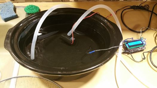
 Here, I used a wall powered GFCI outlet (for safety), with the powerbox/arduino setup, a slow cooker pot, water pump, and a coffee machine water heater.


First, the initial question: Why would ice form when the temperature wasn’t freezing yet? The answer is simple, but probably not something that most people think about. It boils down to radiation. If we think about what temperature the car is in absolute terms (i.e., with the vacuum of space defining a temperature of absolute zero–Zero degrees Kelvin), your car sits at let’s say 35°F=1.7°C=275 °K. This is significantly higher temperature than the vacuum of space, which is readily accepting the radiated heat from your vehicle. Of course if the sky is cloudy, the clouds will be significantly hotter than outer space and the chance of frosting over will be much lower.
Now, to do a quick thought experiment to determine lowest approximate ambient temperature (T∞) that might lead to the window frosting over.
The amount of heat radiated from your car window to space can be described using the Stephan Boltzmann Law (assuming your car window is a black body):
Where q is the heat flux (per unit area), σ is the Stefan Boltzmann constant (5.67E-8 W/m^2/K^4), Twindow is the temperature of your car in Kelvin, and Tspace is the temperature of outer space.
However, the story is not so simple because the car window is actually receiving radiation from all around (the adjacent buildings, walls, etc). Here is a schematic (and actually picture) from the car of the adjacent building that shows the “view factor” of the window to space.

And the actual picture from the car:

In this case, the “view factor”, accounts for what percentage of the window surface can radiate to another object (in this case, we’ll consider outer space and the adjacent house). From this picture, I’ll estimate the view factor of the window to space as ~0.1 (i.e., 10% of the radiation from the window is radiated to space while 90% is radiated to the adjacent house/ground/etc.). Also, the window is at a slightly lower temperature (let’s say the freezing temperature of water, Twindow=32°F=0°C=273.15°K) than the adjacent house (which is warmer–possibly around or slightly higher than the ambient temperature, T∞).
The net heat loss from the window due to radiation can be computed by:
Where we’ve assumed that space is approximately 0°K and that the adjacent house temperature is slightly higher than the ambient temperature (Thouse = T∞+ΔT). With this, we’ve developed a function for the amount of radiative heat transfer out of the window given the ambient temperature (T∞) and an assumption for the house temperature relative to ambient (say ΔT = 4°C or so–as in the house hasn’t quite cooled down to ambient yet–which is reasonable).
Now that we’ve considered the radiative component of heat transfer, let’s consider the counteracting force of convective heat transfer. In this case, because the window is at the frosting temperature (Twindow=0°C=273.15K) and the ambient air is possibly a higher temperature, the ambient air will actually act to warm the window. This will be what is known as natural convection (i.e., cooling by air that moves over a surface due to the fact that it’s being heated or cooling, as opposed to force convection which might happen if it is windy).
The relevant equations that allow us to compute the convective heat transfer coefficient, h is that for the Nusselt number (Nu):

Where kair is the thermal conductivity of air at 0°C (http://www.engineeringtoolbox.com/air-properties-d_156.html) and Lwindow is the characteristic dimension of the window (assumed to be ~1 meter). The remaining parameter is the Rayleigh number (Ra), which is given by:

The Rayleigh number is a dimensionless number that is the product of two other dimensionless numbers: the Grashof number (Gr) and the Prandtl number.

The Grashoff number takes the ratio of the fluid buoyancy to the viscous driving forces. Here, we use the thermal expansivity (β = 1/T for an ideal gas) and the kinematic viscosity of air (νair).
We can compute the Ra number for a given ambient temperature (T∞).


So to answer question two: why didn’t the window on the side of my house ice over? The answer is simple: those windows didn’t radiate directly out to space. Their view factor to the adjacent house was too high, and therefore we had significantly less radiative heat loss (the house was actually radiating its heat to the car as well since they are close). The neighbors house, on the other hand, was too far away to provide the same effect (as it had a lower view factor).
In the case of the smaller view factor to space (in the limit of zero), the window will not freeze until the ambient temperature reaches freezing (in reality, it will have to be below freezing to cool the window). This is why it’s much more difficult for a car to frost when sitting in a garage or under a car port.
Interestingly, previous questions have been asked before:

I’m a PhD, chemical engineering, currently working in R&D for the oil and gas industry.
Quickly, I’ll detail a bit about my research from my PhD. I studied thermoelectric materials with Jeff Snyder (who recently transferred to a professor position at Northwestern University). My PhD focused on improving thermoelectric materials, which convert waste heat into electricity. These solid-state devices perform these conversions with no moving parts, and provide reliable transformation for decades at a time. As a result, these materials are often used in conjunction with nuclear power sources for space missions, basically creating a nuclear battery (known as a radioisotope thermoelectric generator, RTG).
Looking forward to it!
Zach